
Portfolio Website Design Process
- • Web Design
- • UI Developement
- • UX Design
- • Graphic Design
- • HTML & CSS
- • JavaScript
This Website is one of my most well planned projects. I wanted to make sure that it was able to show many of the skills I have learned over the years. Because I wanted to be able to include all my projects (even some of the less impressive or down right terrible ones) to show my growth and progression over the years, I spent a long time trying to figure out the best way to show off my work.
The project outline is as follows:
Click on each section to skip to that part of the project
Sketching & Ideation
It began with some sketches. A notebook and pencil-- I have found-- are great places to start when you don't know where to begin.
A picture of my initial personal contact information sketch for my website header
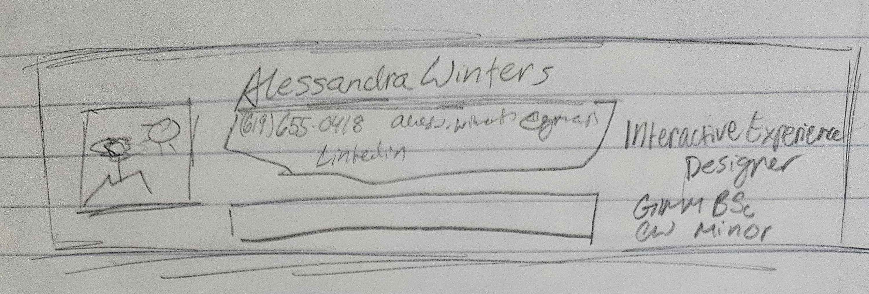
Once I had a list of the information I needed for people to contact me and understand what the site was supposed to be about, I still needed to figure out a way to lay out my personal information in a logical and user friendly way.
This is where sketches two & three came in.
| The left drawing shows the initial layout for my aboute me landing page. | The right drawing shows the initial layout for the favorite projects section of the page. |
|---|---|
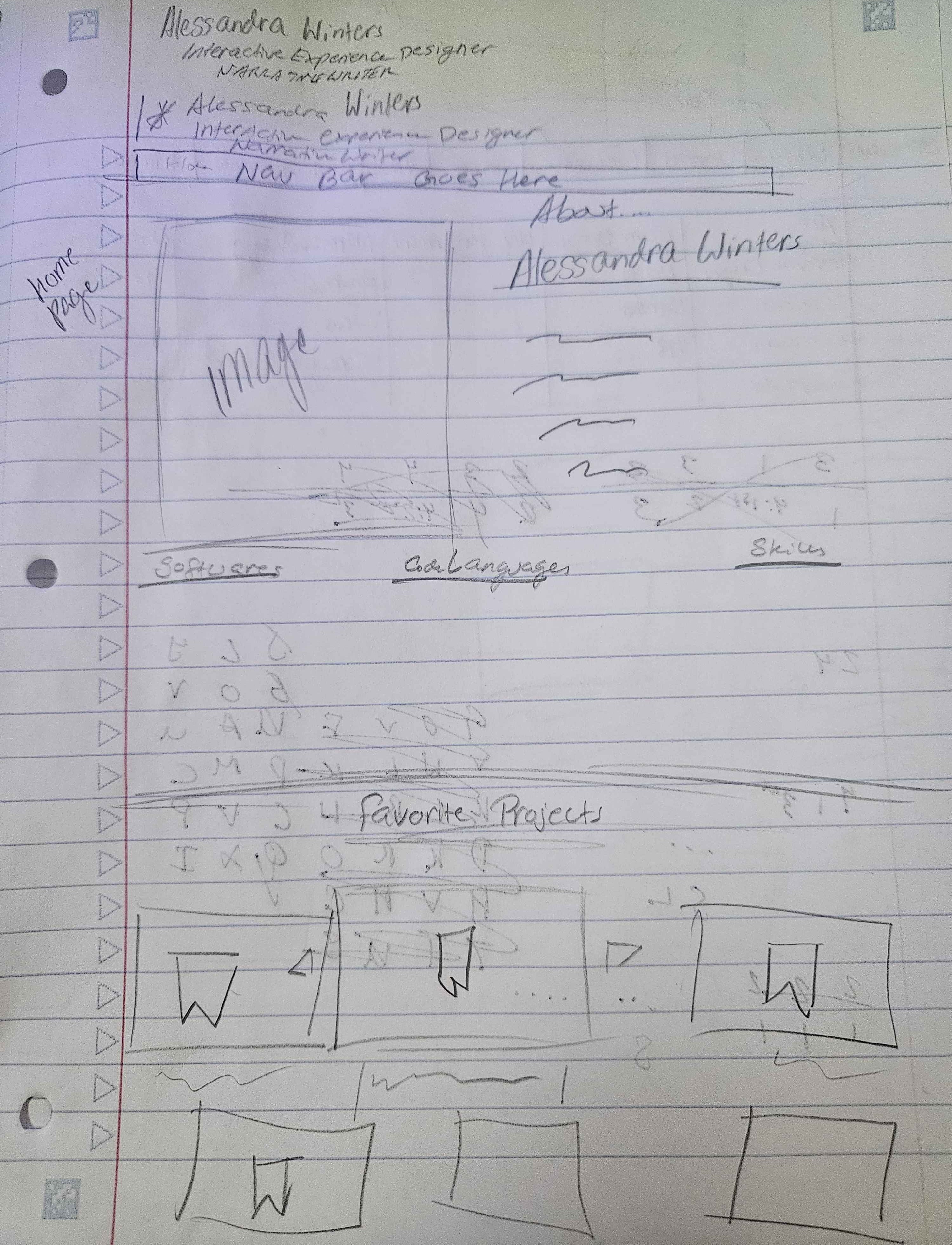
|
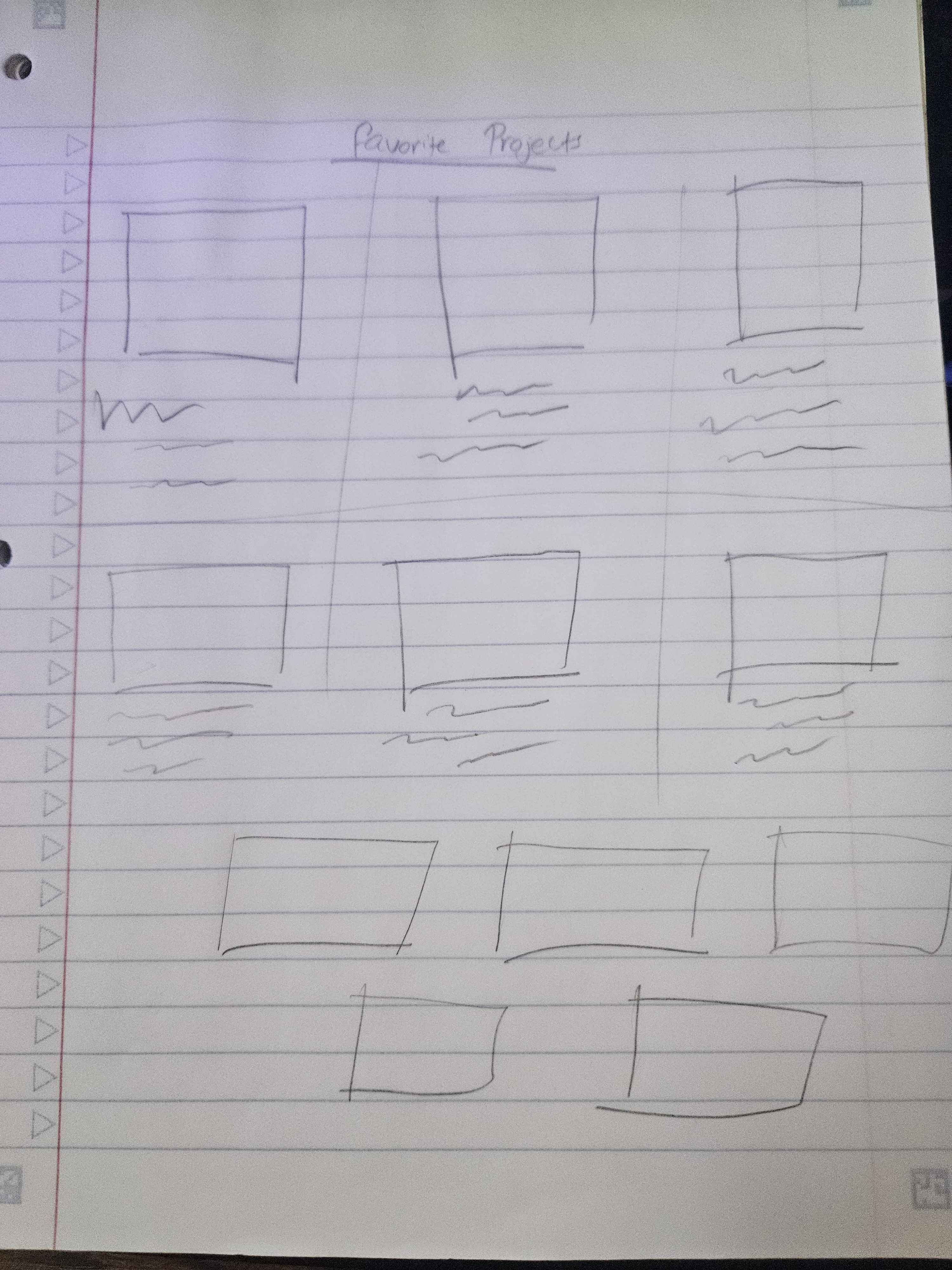
|
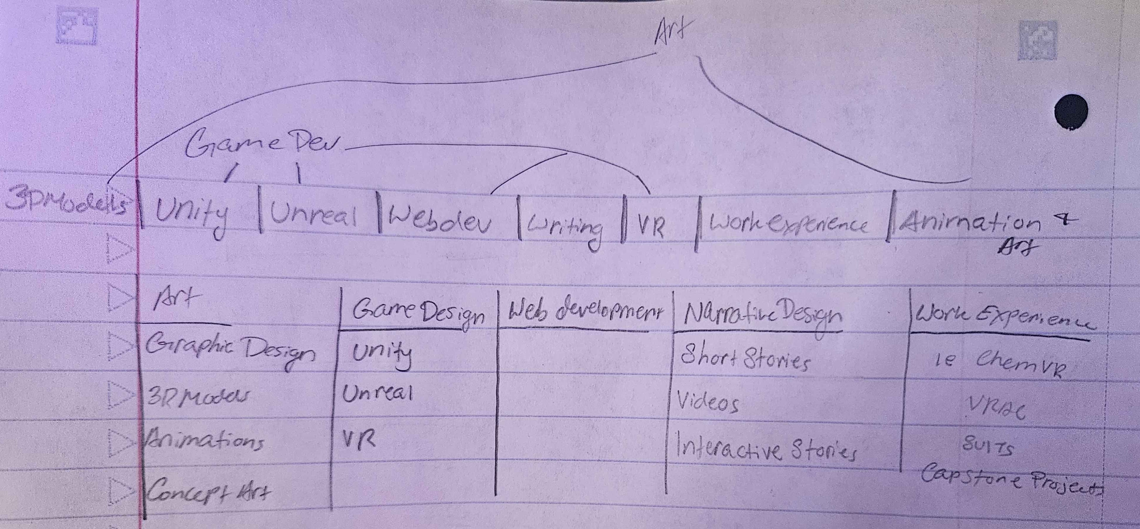
The final step of sketching was laying out the menu and making sure all the parts were well organized. This included planning drop downs and deciding what the drop down options might be.
This sketch shows the initial layout of the nav bar.
Monochromatic Figma Design
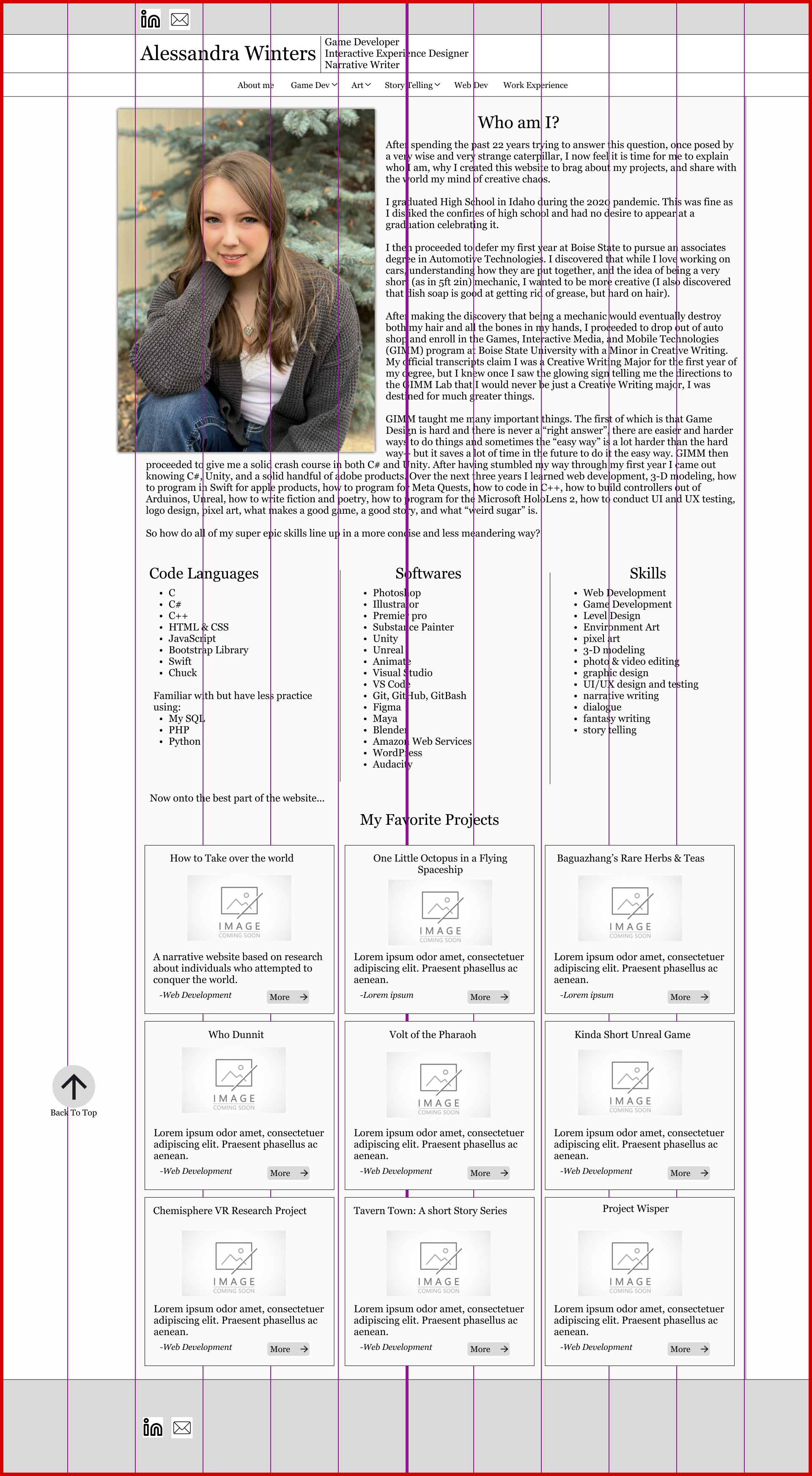
Once the initial sketches were done and I had a visual in mind, I began building a mock-up design in figma. I chose to start in black and white to ensure that the quality of the page came first rather than the decorative aspect. I also included colorful gridlines to help me align page items and better translate the project to the bootstrap 5 grid style layout.
| On the left is the initial figma mock-up of my website. | On the right is the initial mock-up with the gridlines. |
|---|---|
|
|
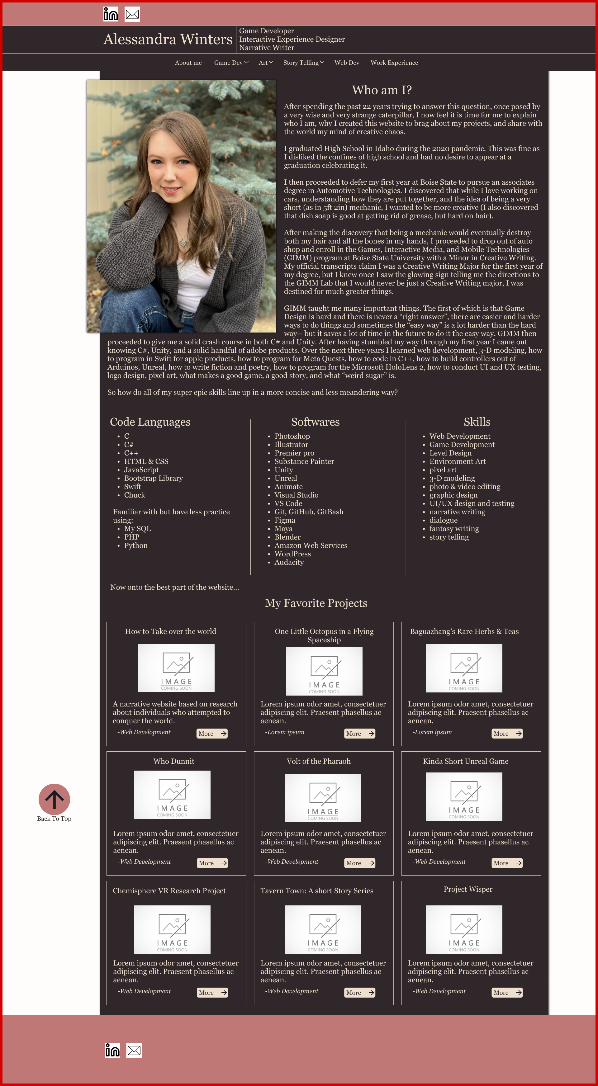
Color Palettes & Colored Mock-Ups
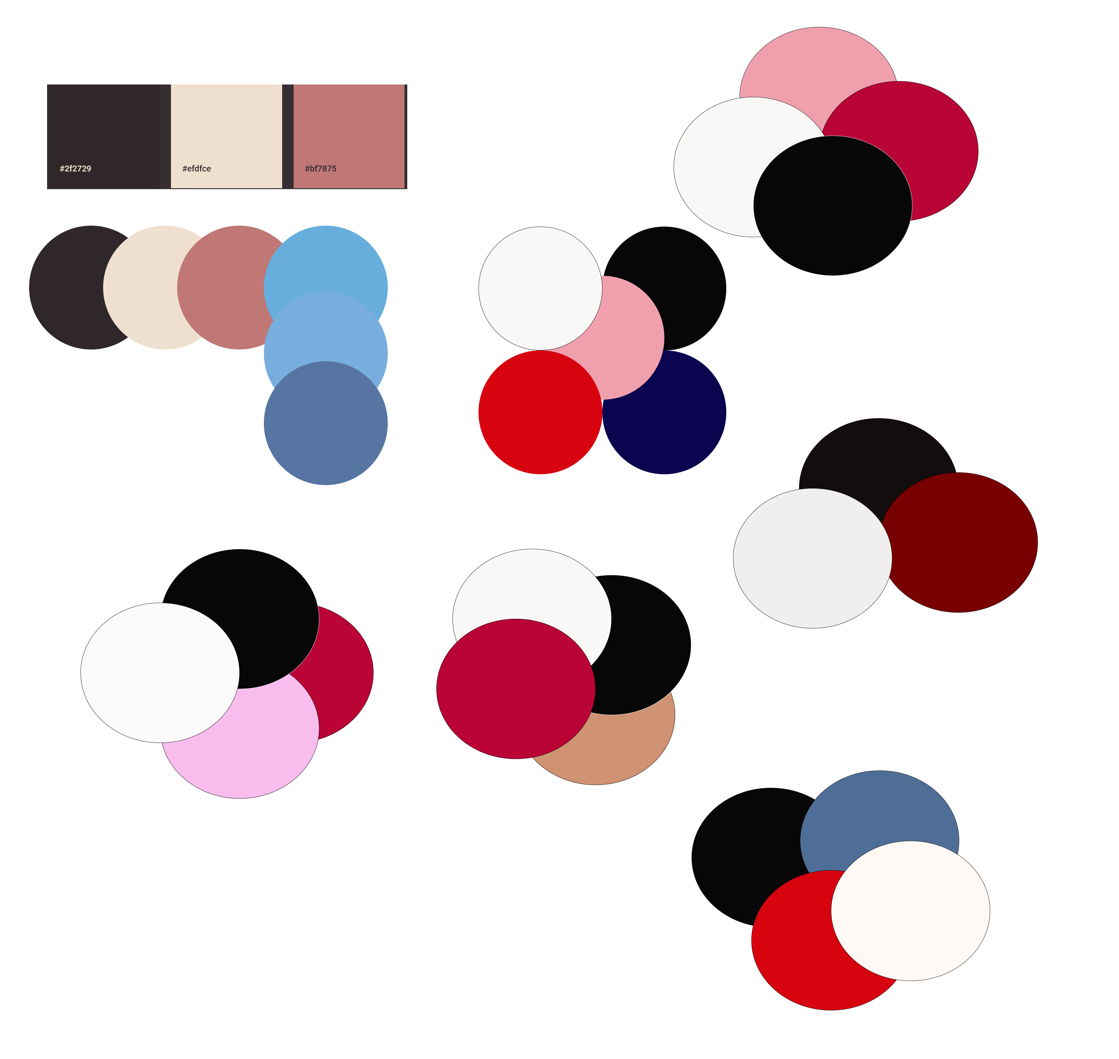
After I had finished designing the initial layout in figma, the next task was picking a pleasing color palette. For me this is often one of the more difficult tasks as I often go through several combinations before settling on one I like. The red and black combination came from a logo design I had been working on, but for the other combinations I utilized several different online generators.
Below is the collection of color paletts I was working from.
|
|
|
|
Below are six different color combinations that I tried before deciding on the black & red design in the bottom right.
|
|
|
|
|
|
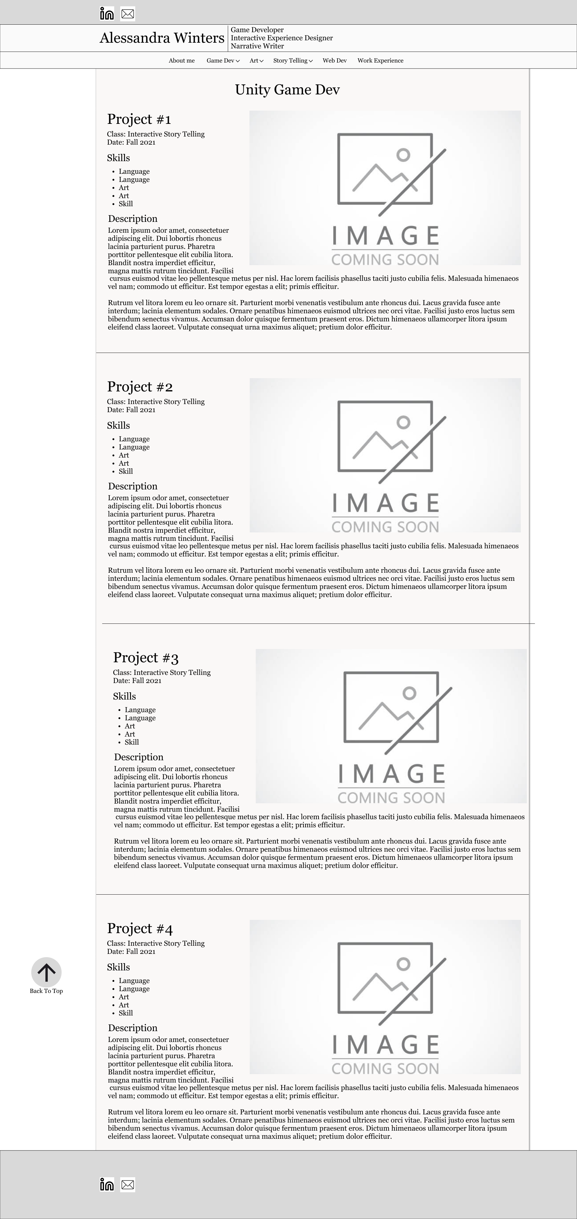
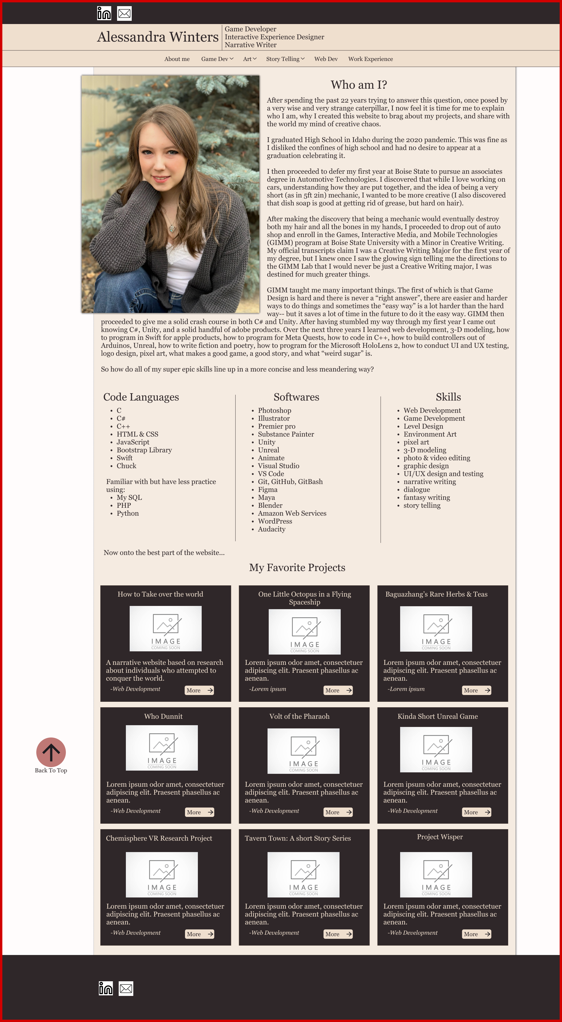
The Final Website
Once I finished designing my site I just had to build it. Because I am hosting this website through github I was unable to use an ASP.Net framework. While limiting, the combination of HTML, CSS, JavaScript, and Bootstrap do create an excellent combination to accomplish alot of things and create a great webpage.